Minnesota Top Team

UX Design Process
DISCOVER
Requirements, Scope, & Goals:
Engaged in an introductory client interview with the gym owners to map out project goals, scope, constraints, and timeline. We reviewed the current web platform and agreed to keep legacy technology in place.
RESEARCH
Competitive Audit:
Researched competitors to create a competitive audit of successful local and nationwide gyms to understand and identify primary users, potential clients, and future growth opportunities.
EVALUATE
Ecosystem Map:
Evaluated the current websites' content, technology, information architecture, and user experience. The site has two navigation systems that are inconsistently used across the site. Many of the menu items lead to dead ends and 404 ages.
Content Audit:
The content audit identified current and outdated information, company offerings and promotions, and proposed future content.
Findings:
- Not enough content or user services to necessitate two navigation systems.
- Multiple outdated content and event pages
- The Minnesota Top Team visual brand was disjointed online and offline.
Task Analysis:
For user experience evaluation, I completed a series of priority tasks analysis to identify site errors, current and potential pain points of users.
Tasks:
- Signing up for free intro sessions.
- Contacting the gym.
- Providing clear and consistent content.
- Promotes new and current members to come to the gym and its events.
Findings:
- Signing up was confusing and complicated. Too many steps involved. Many users got frustrated and quit trying all together or resorted to emailing gym directly.
- Language is confusing and complicates the tasks users most want to complete.
- Multiple dead ends and pages with outdated content and events
Business Metrics:
Next, I evaluated Minnesota Top Team's site analytics. Noting page traffic, interaction, email opens, and click-thru rates. Unfortunately, hotspot and eye trafficking software was not deployed on the site, so the data was unavailable at the time of evaluation.
Client Presentation:
I presented my new site map to the clients, walking them through each page, describing the decision-making process, and how the new hierarchy would improve the overall experience of all users. In addition, a new site structure would also allow them as owners to potentially manage the website, update content, and add and remove pages as needed. With approval, I could move forward in the process of prototyping.
DEFINE
New Sitemap & User Journeys:
Goals:
- Fix current dead ends.
- Edit site map to create one unified navigation.
- Provide direct action items to sign up for classes.
- Provide clear language for the user to understand requirements.
- Expand website to include new gym offerings, deals, and locations.
- Provided sign-ups for each program type.
- Provide information for each program.
- Allow flexibility with adding and removing programs depending on what the gym is currently offering.

PROTOTYPE
Layout Design:
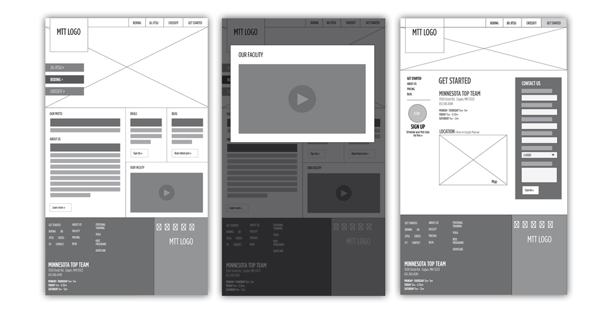
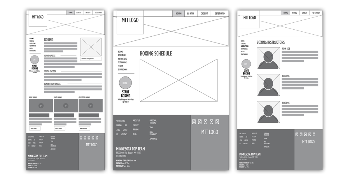

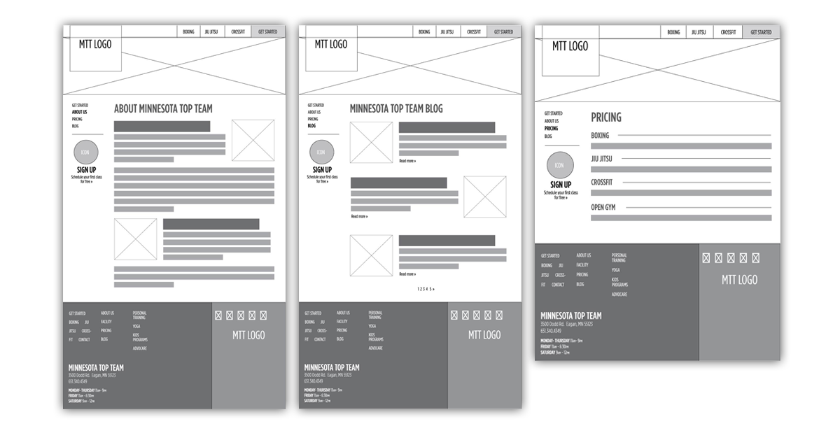
Visual Design:
We kept the original logo and unified the brand around the style of the logo. Then I developed the visual mock-ups with new, consistent brand standards and guidelines.
Color

Typography

BUILD & DEPLOY
- Keep using HubSpot as a provider.
- Pass files to the developer to finish site creation.

